Unified Talent Hub
The Unified Talent Hub transforms the employee experience by bringing assessments, learning, and feedback into one seamless, user-friendly platform.
It enables employees to move through assessments with ease and engage in their career journeys in a way that feels intuitive and motivating. A standout capability is the multi-rater assessment, which captures feedback from peers and managers to provide a more well-rounded perspective on growth.
By streamlining the entire talent management process, the Unified Talent Hub empowers individuals to take ownership of their development within a single, cohesive system.
Adoption Metric
85%
User Satisfaction
4.5 ★
Why Redesign?

For employees, using the old Participant Portal often felt like running through hurdles. They had to jump between different platforms just to complete basic tasks.
Instead of guiding them smoothly, the process was disconnected and frustrating making it harder for people to stay focused on their growth.
The design didn’t help either. It felt flat, uninspiring, and at times overwhelming. Rather than motivating participants, it drained their energy.
This meant the platform wasn’t fulfilling its true purpose: enabling self-development in a simple, engaging way.
The bigger issue was that critical elements — assessments, learning, coaching, feedback, and multi-rater reviews were scattered across tools. This fragmentation not only slowed employees down but also discouraged meaningful participation in their development journey.
Design Iterations & Key Challenges
Solution
Unification & Experience
Unified all features like assessments, results, learning, and feedback into one seamless platform.
Enhanced the portal’s look and feel to make it intuitive, visually engaging, and easy to navigate.
Design Execution
Created user flows and task flows to simplify interactions.
Translated research insights into actionable design concepts.
Built prototypes and validated them through user testing.
Refined designs continuously with feedback from PMs, developers, and the design team.
Scalability & Growth
Optimised performance across devices and ensured accessibility for all employees.
Prepared for future features like multi-rater assessments to enable peer and manager feedback.
Added features that empower users with clear insights and actionable resources for their growth.
Role & Scope

From Idea to Execution
Initial Ideation
Drafted clean, simple layouts
Introduced interactive elements
Added progress tracking for motivation
Evolution
Iterated layouts based on feedback
Prioritised key actions for clarity
Applied purposeful colours for guidance
Finalisation
Validated concepts through user testing
Refined for usability and polish
Delivered a smooth, engaging experience


Each iteration surfaced its own set of challenges — from balancing user simplicity with business demands, to ensuring scalability for future needs. These wireframes became a space to explore trade-offs, test assumptions, and align stakeholders before moving into high fidelity.
Product Complexity
Unifying multiple tools without making the dashboard overwhelming.
Deciding what content should surface upfront vs. stay one click away.
Anticipating scalability for future features without overengineering the current design.
User-Centric Experience
Simplifying navigation for different user types with varied goals.
Designing motivating yet unobtrusive progress indicators.
Balancing clarity with engagement — avoiding an interface that felt too plain or too crowded.
Collaboration & Alignment
Reconciling business needs (visibility of multiple features) with user needs (simplicity and focus).
Iterating rapidly on wireframes to align PMs, developers, and design peers.
Using early prototypes to validate assumptions and reduce ambiguity before high-fidelity work.
For the Employees:
Creating Clarity and Confidence:
The old platform was overwhelming. By organising all tasks into one clear dashboard and adding time estimates, we helped people move from feeling stressed to feeling in control of their professional growth.A Roadmap for Development:
I wanted to connect the dots between assessment results and real improvement. By linking assessments directly to learning materials, the platform became a practical roadmap that showed people exactly how to develop their skills.
For the Business:
Saving Time and Reducing Frustration:
The previous 360° feedback process was a frustrating, manual task. By integrating it directly into the platform, we saved significant administrative time for both employees and HR managers.Clearer Insights for Managers:
Managers now have one reliable place to see how their team members are progressing. This makes coaching conversations much more focused, personal, and helpful.Building a Foundation for the Future:
I designed the system to be flexible and scalable. This means that adding new features down the road will be faster and more cost-effective.

My goal for this project was to go beyond a simple visual update. I wanted to create a more intuitive and valuable experience for the people using it, which in turn would benefit the business. Here’s the difference it made:
The Impact of the Redesign

Smarter, Personalised Learning:
The next step could be to make learning even more personal. Using AI, the platform could suggest specific articles or videos based on a user's unique assessment results, acting as a personalised career coach.
Recognition and Motivation:
A little recognition can go a long way. Adding elements like skill badges or certificates for completing courses would make the learning process more engaging and help build a culture that celebrates growth.
Collaborative Goal Setting:
To enhance teamwork, a great next feature would be a shared space for employees and their managers to set and track development goals together. This would make performance conversations more focused and productive.
A Dedicated Mobile Experience:
Since work isn't confined to a desk, a dedicated mobile app would be a valuable addition. It would allow employees to access learning or give feedback on the go, fitting development into their busy schedules.
This redesign created a strong foundation, but I believe it's just the beginning. If I were to continue working on this product, here are a few opportunities I'm excited about:
Where This Project Could Go Next


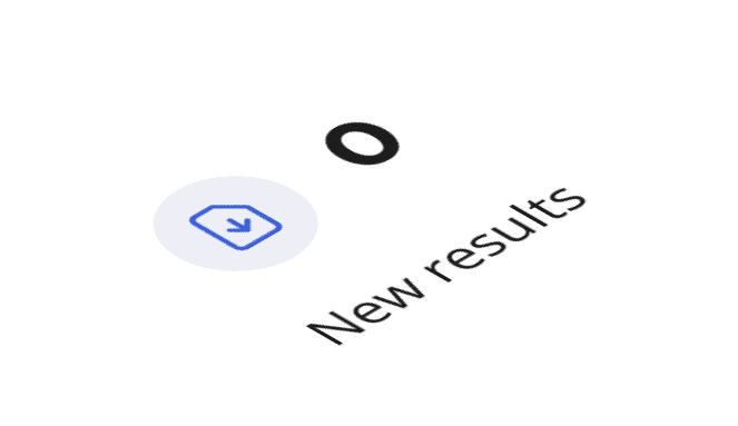
The "To-Do Tasks" Command Center
Problem: In the previous system, users felt adrift, often unsure of their immediate priorities or pending tasks. This ambiguity led to disengagement and missed deadlines.
Design Solution: We established a clear "command center" at the top of the page. This module uses quantifiable numbers to instantly communicate the user's workload—what needs to be done and what's new.
Impact: This design choice provides immediate clarity and direction. It cuts through the noise, reduces cognitive load, and transforms a user's first question from "What am I supposed to do?" to "Which of these 7 tasks should I start first?"
Actionable Self-Assessment Cards
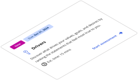
Problem: Vague tasks without context feel like chores. Users would procrastinate on assessments because they were perceived as time-consuming, open-ended commitments.
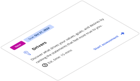
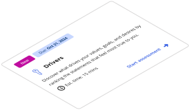
Design Solution: We broke assessments down into individual, digestible "cards." Each card provides crucial context: a clear title, a prominent due date to create urgency, and an estimated completion time to make the task feel manageable.
Impact: This approach manages user expectations and reduces anxiety. By framing a 20-minute task as just that, we empower users to fit development into their busy schedules, significantly boosting engagement and completion rates.


Streamlined Feedback & Rater Requests
Problem: The process of nominating raters and managing 360° feedback was a disconnected, manual nightmare that often happened over email and spreadsheets.
Design Solution: We integrated this complex workflow directly into the dashboard. Users can see exactly who they need feedback from, track the status of each request, and take action—all in one place.
Impact: This feature streamlines a critical and often frustrating process. It reduces the administrative burden on the employee, provides a clear and centralised tracking system, and makes the entire 360° feedback experience feel professional and integrated.
Integrated Learning to Close the Loop
Problem: An assessment is useless if it doesn't lead to action. The old system provided insights but left users with no clear path to improve.
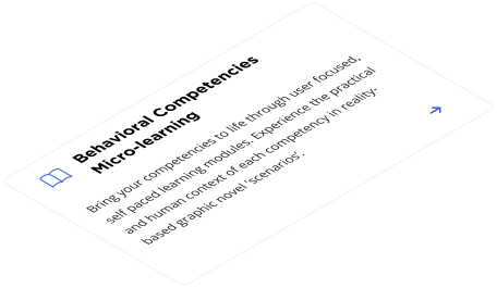
Design Solution: We strategically placed a "Learnings" module on the dashboard, creating a direct bridge from self-assessment to skill development. It offers relevant, accessible content to help users act on their newfound insights.
Impact: This is the feature that closes the feedback loop. It transforms the dashboard from a simple evaluation tool into a true, continuous development platform. It ensures that self-discovery is always followed by an opportunity for growth.




THANK YOU FOR READING